5.26.2010
kinesiology?
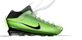
diving back into the oh-so-fun world of portfolio updating, i'm starting to put together the research portion of the Assisted Mobility Device project. i'm not allowed to show the design, but this doesn't really give anything away. Its still a work in progress. I'm starting dig it, but it needs to be CLEANER!


5.25.2010
5.24.2010
5.21.2010
5.20.2010
oldies
5.19.2010
5.18.2010
5.17.2010
5.14.2010
5.13.2010
5.12.2010
colour
trying out some rendering techniques in photoshop. i think i like the second one. the first is a bit sloppy, but lunchtime is up. next time, i won't do so much hatching on the initial sketch. got some great advice from Mark about how I should start using a crisp line to define at least one of my shadow edges, and to also add some darker lines on the outside. cooooooooooooool

5.11.2010
portfolio
I need to choose a direction for my portfolio quick, so that I can actually start working on it. I've decided to give it a 50's vibe. The graphic design from that time period is so sleek and minimal. This is my first attempt at a cover along those lines. It needs to be simplified ALOT. Also, the shapes need to be cleaned up big time. Right now, its pretty blunt that this is taking from the 50's. I think it needs to be much more subtle. This is basically a rough draft. I'm not really getting it yet, but at least I'm actually enjoying it now:

5.10.2010
laundry can be inspiring
5.07.2010
5.06.2010
more shoes
and so it begins
I've started to re-do my portfolio with the intent of making every page count. This isn't the final cover, but I think its the final direction. Still not sure about the image on the page. I struggle a lot with the graphic elements of my portfolio, so this could take a while and might take the place of some sketching

Here's the original:

5.05.2010
Oh no, shoes!
5.04.2010
washing machines
5.03.2010
Subscribe to:
Comments (Atom)


.jpg)
.jpg)


